Color

Color in material design is inspired by bold hues juxtaposed with muted environments, deep shadows, and bright highlights. Material takes cues from contemporary architecture, road signs, pavement marking tape, and athletic courts. Color should be unexpected and vibrant.
Color palette
This color palette comprises primary and accent colors that can be used for illustration or to develop your brand colors. They’ve been designed to work harmoniously with each other.
The color palette starts with primary colors and fills in the spectrum to create a complete and usable palette for Android, Web, and iOS. Google suggests using the 500 colors as the primary colors in your app and the other colors as accents colors.

- Red 500 #f44336
- #ffebee
- 100#ffcdd2
- #ef9a9a
- 300#e57373
- #ef5350
- 500#f44336
- #e53935
- 700#d32f2f
- #c62828
- #b71c1c
- A100#ff8a80
- #ff5252
- #ff1744
- A700#d50000
- Pink 500 #e91e63
- #fce4ec
- 100#f8bbd0
- #f48fb1
- 300#f06292
- #ec407a
- 500#e91e63
- #d81b60
- 700#c2185b
- 800#ad1457
- 900#880e4f
- A100#ff80ab
- #ff4081
- #f50057
- A700#c51162
- Purple 500 #9c27b0
- #f3e5f5
- 100#e1bee7
- #ce93d8
- 300#ba68c8
- #ab47bc
- 500#9c27b0
- #8e24aa
- 700#7b1fa2
- #6a1b9a
- #4a148c
- A100#ea80fc
- #e040fb
- #d500f9
- A700#aa00ff
- Deep Purple 500 #673ab7
- #ede7f6
- 100#d1c4e9
- #b39ddb
- 300#9575cd
- #7e57c2
- 500#673ab7
- #5e35b1
- 700#512da8
- #4527a0
- #311b92
- A100#b388ff
- #7c4dff
- #651fff
- A700#6200ea
- Indigo 500 #3f51b5
- #e8eaf6
- 100#c5cae9
- #9fa8da
- 300#7986cb
- #5c6bc0
- 500#3f51b5
- #3949ab
- 700#303f9f
- #283593
- #1a237e
- A100#8c9eff
- #536dfe
- #3d5afe
- A700#304ffe
- Blue 500 #2196f3
- #e3f2fd
- 100#bbdefb
- #90caf9
- 300#64b5f6
- #42a5f5
- 500#2196f3
- #1e88e5
- 700#1976d2
- #1565c0
- #0d47a1
- A100#82b1ff
- #448aff
- #2979ff
- A700#2962ff
- Light Blue 500 #03a9f4
- #e1f5fe
- 100#b3e5fc
- #81d4fa
- 300#4fc3f7
- #29b6f6
- 500#03a9f4
- #039be5
- 700#0288d1
- #0277bd
- #01579b
- A100#80d8ff
- #40c4ff
- #00b0ff
- A700#0091ea
- Cyan 500 #00bcd4
- #e0f7fa
- 100#b2ebf2
- #80deea
- 300#4dd0e1
- #26c6da
- 500#00bcd4
- #00acc1
- 700#0097a7
- #00838f
- #006064
- A100#84ffff
- #18ffff
- #00e5ff
- A700#00b8d4
- Teal 500 #009688
- #e0f2f1
- 100#b2dfdb
- #80cbc4
- 300#4db6ac
- #26a69a
- 500#009688
- #00897b
- 700#00796b
- #00695c
- #004d40
- A100#a7ffeb
- #64ffda
- #1de9b6
- A700#00bfa5
- Green 500 #4caf50
- #e8f5e9
- 100#c8e6c9
- #a5d6a7
- 300#81c784
- #66bb6a
- 500#4caf50
- #43a047
- 700#388e3c
- #2e7d32
- #1b5e20
- A100#b9f6ca
- #69f0ae
- #00e676
- A700#00c853
- Light Green 500 #8bc34a
- #f1f8e9
- 100#dcedc8
- #c5e1a5
- 300#aed581
- #9ccc65
- 500#8bc34a
- #7cb342
- 700#689f38
- #558b2f
- #33691e
- A100#ccff90
- #b2ff59
- #76ff03
- A700#64dd17
- Lime 500 #cddc39
- #f9fbe7
- 100#f0f4c3
- #e6ee9c
- 300#dce775
- #d4e157
- 500#cddc39
- #c0ca33
- 700#afb42b
- #9e9d24
- #827717
- A100#f4ff81
- #eeff41
- #c6ff00
- A700#aeea00
- Yellow 500 #ffeb3b
- #fffde7
- 100#fff9c4
- #fff59d
- 300#fff176
- #ffee58
- 500#ffeb3b
- #fdd835
- 700#fbc02d
- #f9a825
- #f57f17
- A100#ffff8d
- #ffff00
- #ffea00
- A700#ffd600
- Amber 500 #ffc107
- #fff8e1
- 100#ffecb3
- #ffe082
- 300#ffd54f
- #ffca28
- 500#ffc107
- #ffb300
- 700#ffa000
- #ff8f00
- #ff6f00
- A100#ffe57f
- #ffd740
- #ffc400
- A700#ffab00
- Orange 500 #ff9800
- #fff3e0
- 100#ffe0b2
- #ffcc80
- 300#ffb74d
- #ffa726
- 500#ff9800
- #fb8c00
- 700#f57c00
- #ef6c00
- #e65100
- A100#ffd180
- #ffab40
- #ff9100
- A700#ff6d00
- Deep Orange 500 #ff5722
- #fbe9e7
- 100#ffccbc
- #ffab91
- 300#ff8a65
- #ff7043
- 500#ff5722
- #f4511e
- 700#e64a19
- #d84315
- #bf360c
- A100#ff9e80
- #ff6e40
- #ff3d00
- A700#dd2c00
- Brown 500 #795548
- #efebe9
- 100#d7ccc8
- #bcaaa4
- 300#a1887f
- #8d6e63
- 500#795548
- #6d4c41
- 700#5d4037
- #4e342e
- #3e2723
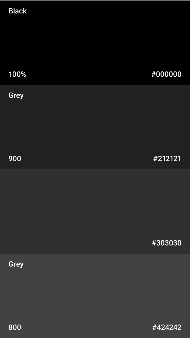
- Grey 500 #9e9e9e
- #fafafa
- 100#f5f5f5
- #eeeeee
- 300#e0e0e0
- #bdbdbd
- 500#9e9e9e
- #757575
- 700#616161
- #424242
- #212121
- Blue Grey 500 #607d8b
- #eceff1
- 100#cfd8dc
- #b0bec5
- 300#90a4ae
- #78909c
- 500#607d8b
- #546e7a
- 700#455a64
- #37474f
- #263238
- Black#000000
- #ffffff
UI color application
Choose your palette
Limit your selection of colors by choosing three hues from the primary palette and one accent color from the secondary palette.
Related


Use opacity for text, icons, and dividers
You can change the opacity of text to convey how important certain information is relative to other text.
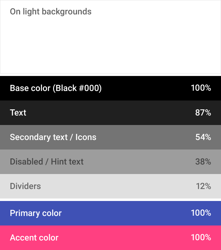
Dark text on light backgrounds

White text on dark backgrounds
Dark text on light backgrounds
For dark text on a light background, the most important text has an opacity of 87%. Secondary text, which is lower in the visual hierarchy, has an opacity of 54%. Text hints, like those in text fields and labels, and disabled text have even lower visual prominence with an opacity of 26%.
Dark text (#000000) | Opacity |
Primary text | 87% |
Secondary text | 54% |
Hint and disabled text and icons | 38% |
White text on dark backgrounds
The chart values relay relative levels of importance for white text on dark backgrounds.
Hint and disabled content
Hint and disabled text and icons have an opacity of 26% for dark text on light backgrounds, and an opacity of 30% for white text on dark backgrounds.
Text on colored backgrounds
For white or black text on colored backgrounds, see these tables of color palettes for the appropriate contrast ratios and hex values.
Other elements
Other elements, such as icons and dividers, benefit from having a hex value of black or white so that they work on backgrounds of any color.
Light text (#FFFFFF) | Opacity |
Primary text | 100% |
Secondary text | 70% |
Hint and disabled text and icons | 30% |
Toolbars and status bars
Toolbars and larger color blocks should use the 500 color of the primary color of your app. The status bar should be the darker 700 tint of your primary color.
Bold use of color in large fields is encouraged. Different elements in the UI can take on different parts of your color theme.

The toolbar uses the 500 version of indigo, while the status bar uses the 700 version.

When editing a folder name, the entire title and description area uses indigo as the background color.
Accent color
Use the accent color for your primary action button and components like switches or sliders.

Floating accent button using the accent color

Switch using the accent color

Only use the accent color for body text to accent a web link.

Don’t use the accent color for body text color.

Use the accent color for your primary action button and components like switches or sliders.

Don’t use the accent color for app bars or larger areas of color. Avoid using the same color for the floating action button and the background.
Fallback accent colors
If your accent color is too light or dark to sufficiently contrast with the background color, use a darker or lighter tint of the accent color instead. If your accent color doesn’t work at all, use the 500 version of your primary color on white backgrounds. If your background color is the 500 version of your primary color, make your accent color either white 100% or black 54%.

Use a fallback accent color over background colors that are too light or too dark.

Don’t use the accent color over a background color if there isn’t enough contrast.
Themes
Themes let you apply a consistent tone to an app. The theme specifies the darkness of the surfaces, level of shadow, and appropriate opacity of ink elements. To promote greater consistency between apps, light and dark themes are available to choose from.
Light theme
1. Status bar
2. App bar
3. Background
4. Cards/Dialogs

Light theme palette

UI application
Dark theme
1. Status bar
2. App bar
3. Background
4. Cards/Dialogs
Dark theme palette

UI application